Tripadvisor Experiences (2021)
Book unique experiences to enhance your travels.

Overview
Redesigned the front-end highlights reviews section, as well as the booking flow, for B2C web users.
Role
(Afiqa + UXD) + UXW (R)
(Afiqa + UXD) + UXW (A)
Director of PD + UXD, HQ + Legal (C)
VP of PD (I)
Duration
4-5 weeks
Deliverables
High-fidelity mockups and interactive prototypes across all screen resolutions.
THE PROBLEM
Attraction Review Pages (ARPs) were not converting well into bookings, but they were still crucial to the business because they generated revenue from attraction vendors and display ads. The highlights review section featured the most trustworthy user-generated content (UGC) reviews. Refining the booking process could increase ticket sales.
Tripadvisor engaged a third-party agency to help increase conversion for Experiences ARPs. The agency helped select a direction, but it got shelved pre-pandemic. When it was time to revitalize Experience ARPs, we needed to fix a few extra issues.
Who are the travelers?
Mostly, big groups and families travel domestically or internationally. They look for unique experiences their destination offers, guided by the most credible reviews.
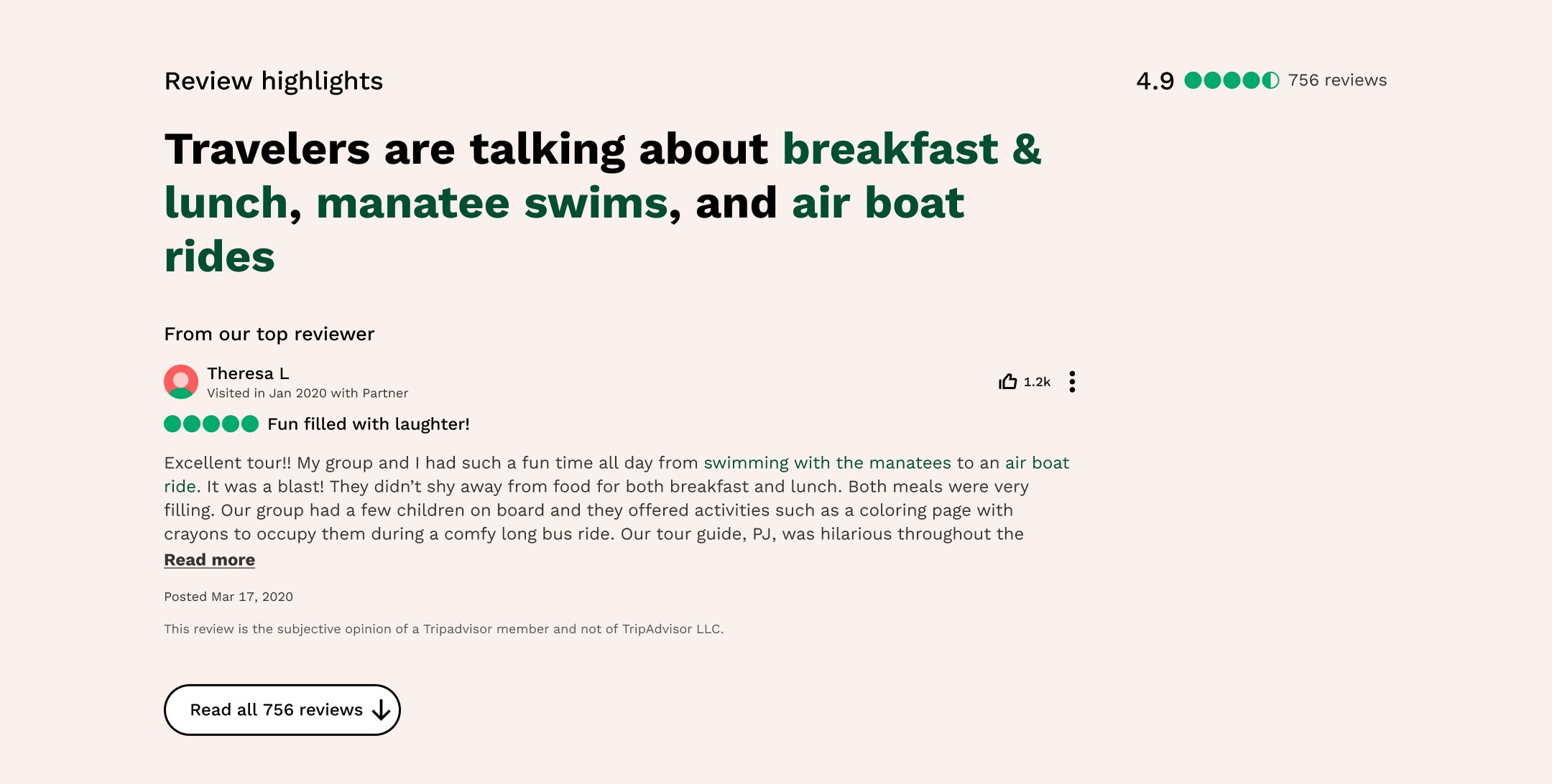
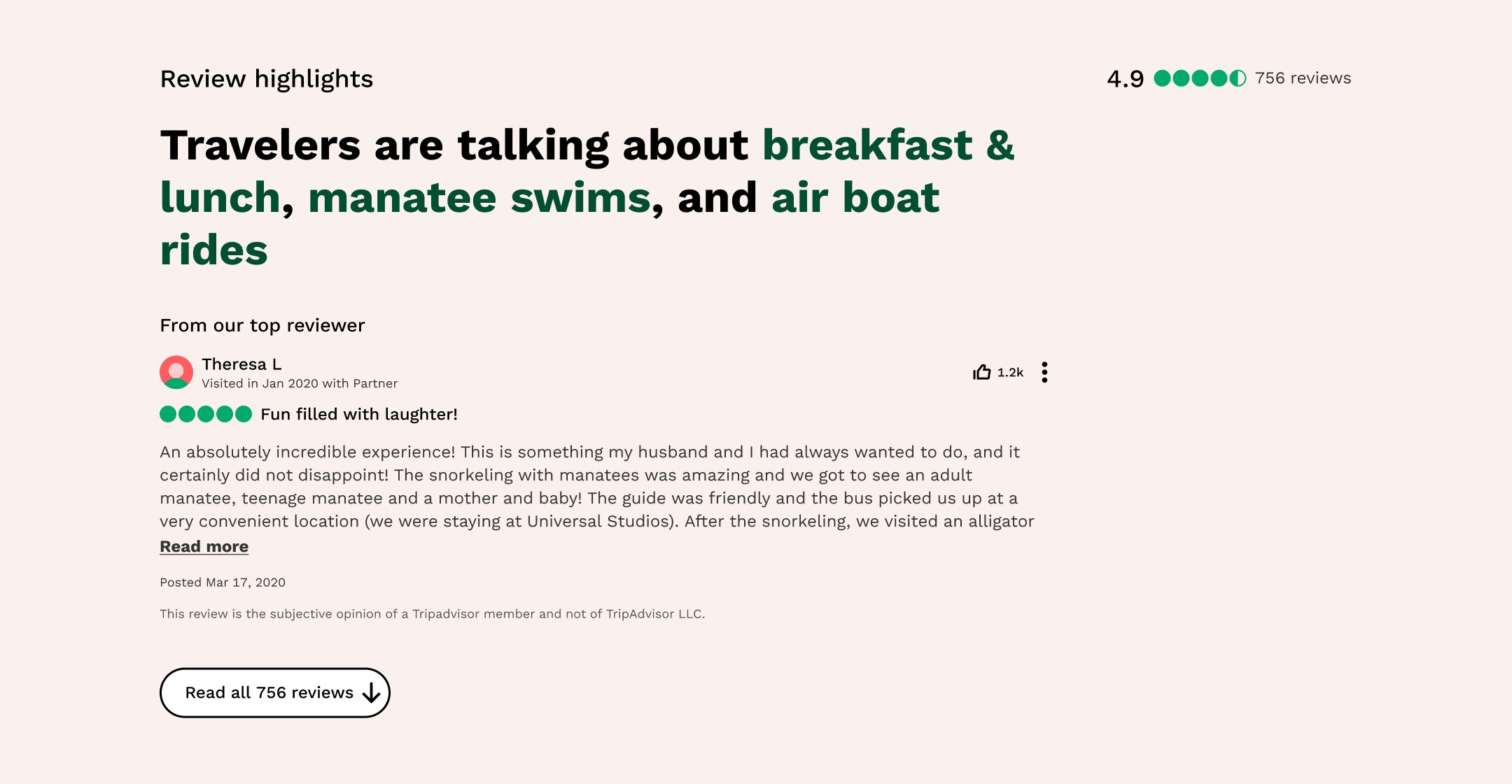
Highlights review sectionAs travelers arrive on the page, they view the price and scroll to the reviews section. Instead of mentally sorting through reviews, the highlights review would reduce analysis paralysis for travelers. It cuts through the noise in searching for suitable activities.
From a business perspective, Tripadvisor was sitting on underutilized data. The highlights review section showcased the most credible UGC reviews for trustworthiness.
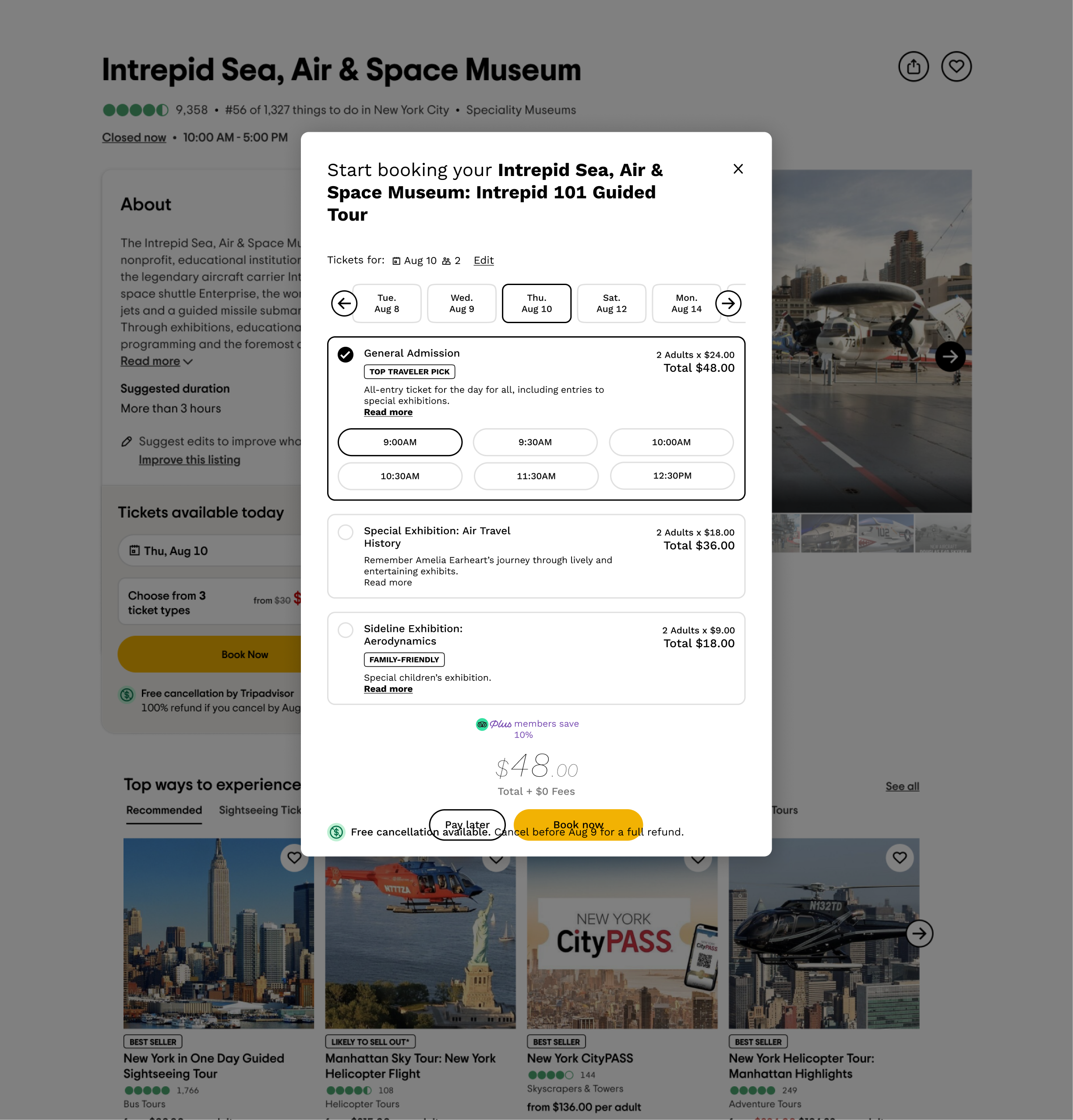
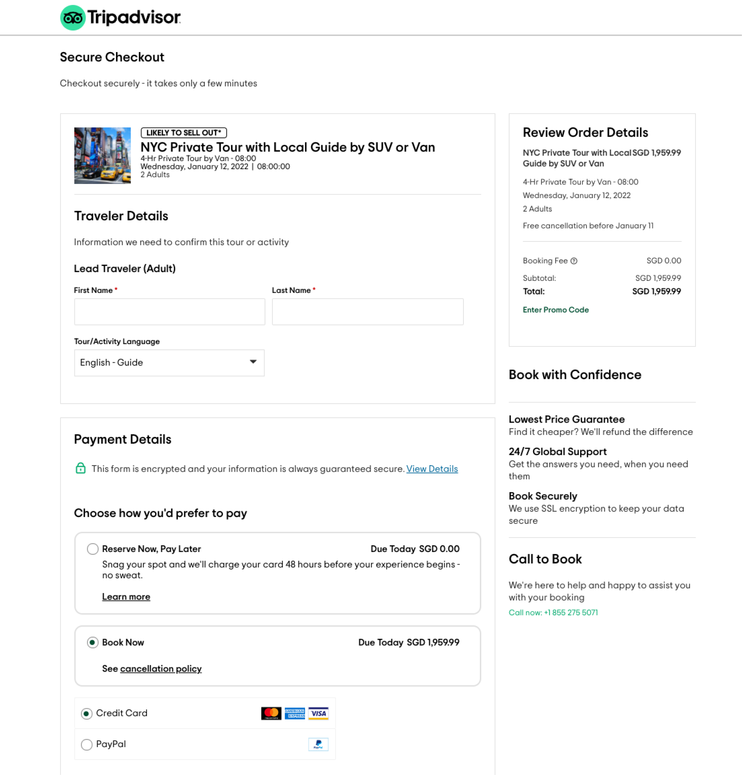
Booking section How can we get users from browsing ARPs to checkout? The crucial part of the flow is helping travelers find the best available tickets.
Before, the date picker showed all dates, including sold-out. That overwhelms the user with unnecessary information that is beyond their control. We needed to solve validation issues with the guest picker as it comes after the date picker. We checked it against the design system components. It simplifies the booking experience.
THE APPROACH
Highlights review sectionIn our design analysis, we conducted a heuristic evaluation of the existing site and found visual inconsistencies as the old design system components needed updating with the new. Next, through a competitive analysis of top review sites such as Google, Yelp, and Airbnb, we compared how their design components in reviews worked for their use cases, such as with readability, writing reviews with/out log-in, and effective microcopy for continued reading of review snippets.
In a design critique session, we found that the previously proposed designs had generic titles. Instead, we could apply thematic headlines and highlight the most popular words mentioned in reviews. We asked: Under what parameters are top reviews categorized? As it was recommended pre-Covid, how can it integrate themes and considerations of public health now?
Next, I checked the legal disclaimer with our UX writer and legal team to ensure that highlighting UGC reviews on our site keeps the business liability-free. Then, I crafted a Read More CTA for reviews with multiple lines to give more context and facilitate in-depth guidance for the traveler.
For wireframing, we explored three ways:
Version 1 - as originally proposed by the external agency, with Guidance improvements
Version 2 - Top ‘Popular Mentions’ Headline + Top Review with Keyword
Version 3 - Top ‘Popular Mentions’ Headline + Supporting Reviews

Experiences ARPs Highlights Desktop Version 1 (short)

Experiences ARPs Highlights Desktop Version 1 (expanded)

Experiences ARPs Highlights Desktop Version 2 (short)

Experiences ARPs Highlights Desktop Version 2 (expanded)

Experiences ARPs Highlights Desktop Version 3 (short)

Experiences ARPs Highlights Desktop Version 3 (modal)
Booking section In our design analysis, we conducted a competitive review. Key takeaways include a clear hierarchy of information and relatedness, feedback and ticket availability made clear with visual indicators, and a fast yet flexible flow. Next, we mapped out the user flow by first understanding the patterns of ticket purchase flows. Following this, low-fidelity wireframing exercises to work on the skeleton and possible edge cases before refining and distilling concepts into high-fidelity wireframes and interactive prototypes.
In wireframing the availability modal, we explore three ways:
Version 1 - Full view, with pre-selected details and date carousel
Version 2 - Full view, with pre-selected details and focus on Ticket type
Version 3 - Full view, with date carousel only

EXP ARP Booking Desktop.png

EXP ARP Booking Desktop - Modal.png

EXP ARP Booking Desktop - Checkout.png
We spruced up the following with new design system components:
Date Picker Calendar view when 'Edit' CTA is clicked
Guest Picker Guests view when 'Edit' CTA is clicked
Edge cases include:
Availability for tickets, dates, and times are many (three or up to six) to none or limited to specific age groups.
And opportunities to test long-string pricing (the currency converted locally from USD, as in the case of internationalization).
THE SOLUTION
Highlights review sectionV3 supporting review cards with V1 guidance headline
Source, last captured 11/10/2023 (see below).
Booking sectionFirstly, play this clip of the Booking Modal prototype.
Next, play this clip of the Booking In-page prototype.
Finally, play this clip of the Booking Mobile prototype.
IMPACT
Gained trust and alignment from stakeholders and identified several opportunities for usability testing.
RETROSPECTIVES
Highlights review sectionThe plus side of designing in-house was that we had insider insight and context into how the business was running. Thus, we were able to recommend solutions that align with both user needs (guiding and enhancing their travel) and business goals (keeping the lights on). These strategic recommendations position the business as dependable, credible, and responsible in a pandemic.
I tried to balance honoring the agency's work and contributing my ideas to improve the ecosystem. We were fortunate in getting quick internal validation of whether pieces of microcopy, for instance, made sense. That is likely to happen only when working in-house.
Booking section Typically, a popular choice of evaluation studies is A/B testing. We suggested opportunities for usability testing in some areas, such as date availability, guest & and date picker, modal vs module within the page on the desktop, urgency messaging, and social proof (best sellers, ratings, reviews, etc). With usability studies, the iterations could be further refined.
